Java and IDEs for the R/Python world

(Some tips on how to use Java if you’re from R or Python; some thoughts on software platforms and programming for data-science-or-whatever-we-call-it-now.)

Most of my research these days uses Python, R, or Java. It’s terrific that so many people are using Python and R as their primary langauges now; this is way better than the bad old days when people overused Java just because that’s what they learned in their intro CS course. Python/R are better for many things. But fast, compiled, static languages are still important[1], and Java still seems to be a very good cross-platform approach for this[2], or at the very least, it’s helpful to know how to muck around with CoreNLP or Mallet. I think in undergrad I kept annoying my CS professors that we needed to stop using Java and do everything in Python, but I honestly think we now have the opposite problem — I’ve met many people recently who do lots of programming without traditional CS training (e.g. from the natural sciences, social sciences, statistics, humanities, etc.), who need to pick up some Java but find it fairly different than the lightweight languages they first learned. I don’t know what are good overall introductions to the language for this audience, but here’s a little bit of information about development tools which make it easier.

Unlike R or Python, Java is really hard to program with just a text editor. You have to import tons of packages to do anything basic, and the names for everything are long and easy to misspell, which is extra bad because it takes more lines of code to do anything. While it’s important to learn the bare basics of compiling and running Java from the commandline (at the very least because you need to understand it to run Java on a server), the only good way to write Java for real is with an IDE. This is more complicated than a text editor, but once you get the basics down it is much more productive for most things. In many ways Java is an outdated, frustrating language, but Java plus an IDE is actually pretty good.

The two most popular IDEs seem to be Eclipse and IntelliJ. I’ve noticed really good Java programmers often prefer IntelliJ. It’s probably better. I use Eclipse only because I learned it a long time ago. They’re both free.

The obvious things an IDE gives you include things like autosuggestion to tell you method names for a particular object, or instantly flagging misspelled variable names. But the most useful and underappreciated features, in my opinion, are for code navigation and refactoring. I feel like I became many times more productive when I learned how to use them.

For example:

  1. Go to a definition (Eclipse name: “Open Declaration”). Hold “Command” then all the function names, class names, and variable names will get underlines. You can click one to navigate to where it’s declared. This is really helpful to follow method calls. You basically are following the path your program would take at runtime. You can even navigate into the code for any library or the standard library.
  2. Back: this is a button on the toolbar. After you navigated to a declaration, use the this to go back to where you were before. This lets you do things like go to a method just to quickly refresh your memory about what’s going on, or maybe go to a class to remember what things are in it, then after a second go right back to what you were working on. This lets you effectively deal with a lot more complexity without holding it all in your head at once.

(The “Command” key is for Mac with Eclipse; there are equivalents for Linux and Windows and other IDEs too.)

With these two commands, you can move through your code, and other people’s code, like it’s a web browser. Enabling keyboard shortcuts makes it work even better. Then you can press a keyboard shortcut to navigate to the the function currently under your cursor, and press another to go back to where you were. I think that by default these two commands don’t both have shortcuts; it’s worth adding them yourself (in Preferences). I actually mapped them to be like Chrome or Safari, using Command-[ and Command-] for Back and Open Declaration, respectively. I use them constantly when writing Java code.

But that’s just one navigational direction. You can also traverse in other directions with:

  • See all references (Eclipse: right-click, “References”; or, Cmd-Shift-G). You invoke this on a function name in the code. Then you’ll get a listing on the sidebar of all places that call that function, and you can click on them to go to them. As opposed to going to a declaration, this lets you go backwards in a hypothetical call stack. It’s like being able to navigate to all inbound links, like all “cited by” in Google Scholar. And it’s useful for variables and classes, too. By invoking this on different things in your code, you quickly get little ego-network snapshots of your codebase’s dependency graph. This not only helps you track down bugs, but helps you figure out how to refactor or restructure your code.

There are many other useful navigational features as well, such as navigating to a class by typing a prefix of its name; and many other IDE features too. Different people tend to use different ones so it’s worth looking at what different people use.

Finally, besides navigation, a very useful feature is rename refactoring: any variable or function or class can be renamed, and all references to it get renamed too. Since names are pretty important for comprehension, this actually makes it much easier to write the first draft of code, because you don’t have to worry about getting the name right on the first try. When I write large Python programs, I find I have to spend lots of time thinking through the structure and naming so I don’t hopelessly confuse myself later. There’s also move refactoring, where you can move functions between different files.

Navigation and refactoring aren’t just things for Java; they’re important things you want to do in any language. There are certainly IDEs and editor plugins for lightweight languages as well which support these things to greater or lesser degrees (e.g. RStudio, PyCharm, Syntastic…). And without IDE support, there are unix-y alternatives like CTags, perl -pi, grep, etc. These are good, but their accuracy relative to the semantics you care about often is less than 100%, which changes how you use them.

Java and IDE-style development feel almost retrospective in some ways. To me at least, they’re associated with a big-organization, top-heavy, bureaucratic software engineering approach to programming, which feels distant from the needs of computational research or startup-style lightweight development. And they certainly don’t address some of the major development challenges facing scientific programming, like dependency management for interwoven code/data pipelines, or data/algorithm visualization done concurrently with code development. But these tools still the most effective ones for a large class of problems, so worth doing well if you’re going to do them at all.

[1]: An incredibly long and complicated discussion addressed in many other places, but in my own work, static languages are necessary over lightweight ones for (1) algorithms that need more speed, especially ones that involve graphs or linguistic structure, or sample/optimize over millions of datapoints; (2) larger programs, say more than a few thousand lines of code, which is when dynamic typing starts to turn into a mess while static typing and abstractions start to pay off; (3) code with multiple authors, or that develops or uses libraries with nontrivial APIs; in theory dynamic types are fine if everyone is super good at communication and documentation, but in practice explicit interfaces make things much easier. If none of (1-3) are true, I think Python or R is preferable.

[2]: Long story here and depends on your criteria. Scala is similar to Java in this regard. The main comparison is to C and C++, which have a slight speed edge over Java (about the same for straightforward numeric loops, but gains in BLAS/LAPACK and other low-level support), are way better for memory usage, and can more directly integrate with your favorite more-productive high-level language (e.g. Python, R, or Matlab). But the interface between C/C++ and the lightweight language you care about is cumbersome. Cython and Rcpp do this better — and especially good if you’re willing to be tied to either Python or R — but they’re still awkward enough they slow you down and introduce new bugs. (Julia is a better approach since it just eliminates this dichotomy, but is still maturing.) C/C++’s weaknesses compared to Java include nondeterministic crashing bugs (due to the memory model), high conceptual complexity to use the better C++ features, time-wasting build issues, and no good IDEs. At the end of the day I find that I’m usually more productive in Java than C/C++, though the Cython or Rcpp hybrids can get to similar outcomes. These main criteria somewhat assume a Linux or Mac platform; people on Microsoft Windows are in a different world where there’s a great C++ IDE and C# is available, which is (mostly?) better than Java. But very few people in my work/research world use Windows and it’s been like this for many years, for better or worse.
Leave a comment

Replot: departure delays vs flight time speed-up

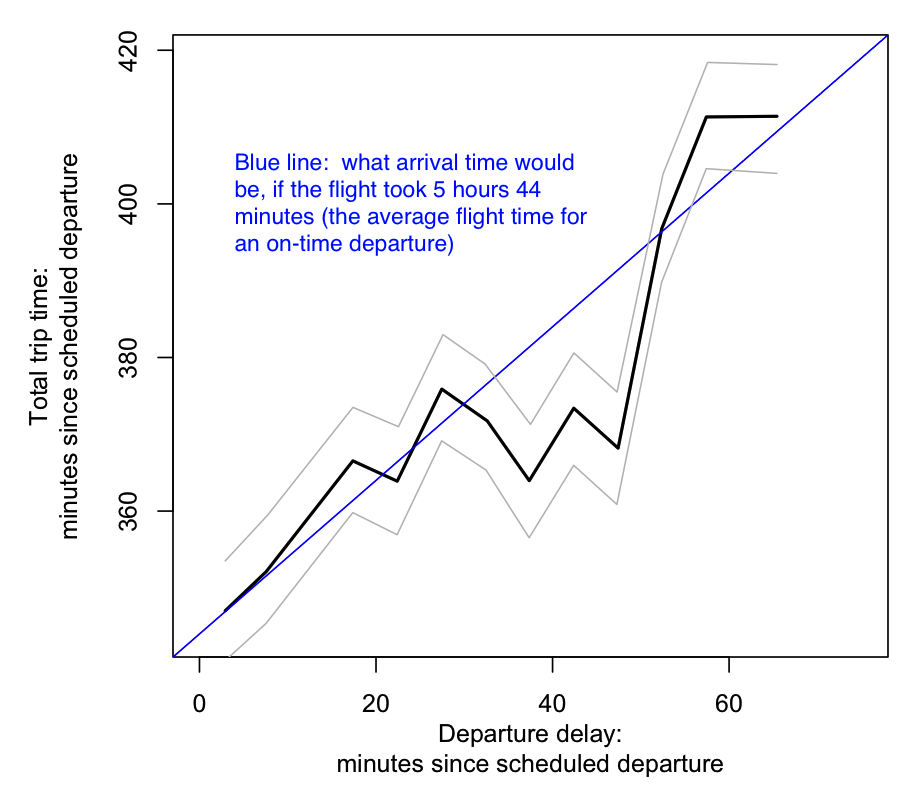
Here’s a re-plotting of a graph in this 538 post. It’s looking at whether pilots speed up the flight when there’s a delay, and find that it looks like that’s the case. This is averaged data for flights on several major transcontinental routes.

I’ve replotted the main graph as follows. The x-axis is departure delay. The y-axis is the total trip time — number of minutes since the scheduled departure time. For an on-time departure, the average flight is 5 hours, 44 minutes. The blue line shows what the total trip time would be if the delayed flight took that long. Gray lines are uncertainty (I think the CI due to averaging).

markedup_plot2

What’s going on is, the pilots seem to be targeting a total trip time of 370-380 minutes or so. If the departure is only slightly delayed by 10 minutes, the flight time is still the same, but delays in the 30-50 minutes range see a faster flight time which makes up for some of the delay.

The original post plotted the y-axis as the delta against the expected travel time (delta against 5hr44min). It’s good at showing that the difference does really exist, but it’s harder to see the apparent “target travel time”.

Also, I wonder if the grand averaging approach — which averages totally different routes — is necessarily the best. It seems like the analysis might be better by adjusting for different expected times for different routes. The original post is also interested in comparing average flight times by different airlines. You might have to go to linear regression to do all this at once.

I got the data by pulling it out of 538′s plot using the new-to-me tool WebPlotDigitizer. I found it pretty handy! I put files and plotting code at github/brendano/flight_delays.

Leave a comment

What the ACL-2014 review scores mean

I’ve had several people ask me what the numbers in ACL reviews mean — and I can’t find anywhere online where they’re described. (Can anyone point this out if it is somewhere?)

So here’s the review form, below. They all go from 1 to 5, with 5 the best. I think the review emails to authors only include a subset of the below — for example, “Overall Recommendation” is not included?

The CFP said that they have different types of review forms for different types of papers. I think this one is for a standard full paper. I guess what people really want to know is what scores tend to correspond to acceptances. I really have no idea and I get the impression this can change year to year. I have no involvement with the ACL conference besides being one of many, many reviewers.

Continue reading

2 Comments

Scatterplot of KN/PYP language model results

I should make a blog where all I do is scatterplot results tables from papers. I do this once in a while to make them eaiser to understand…

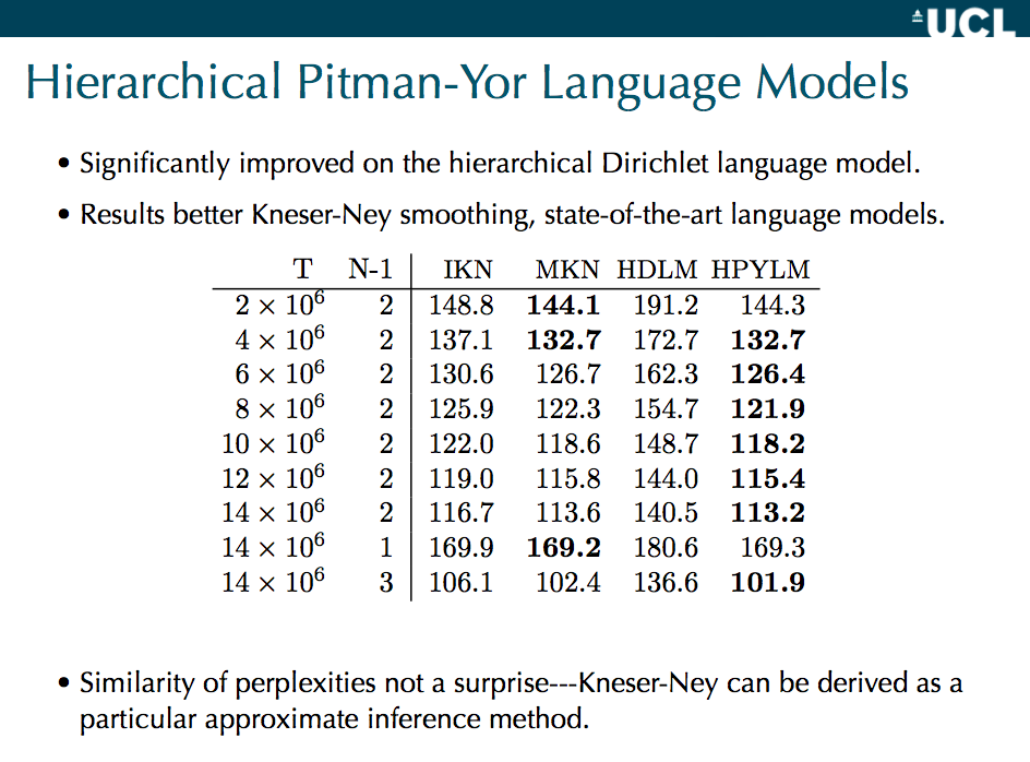
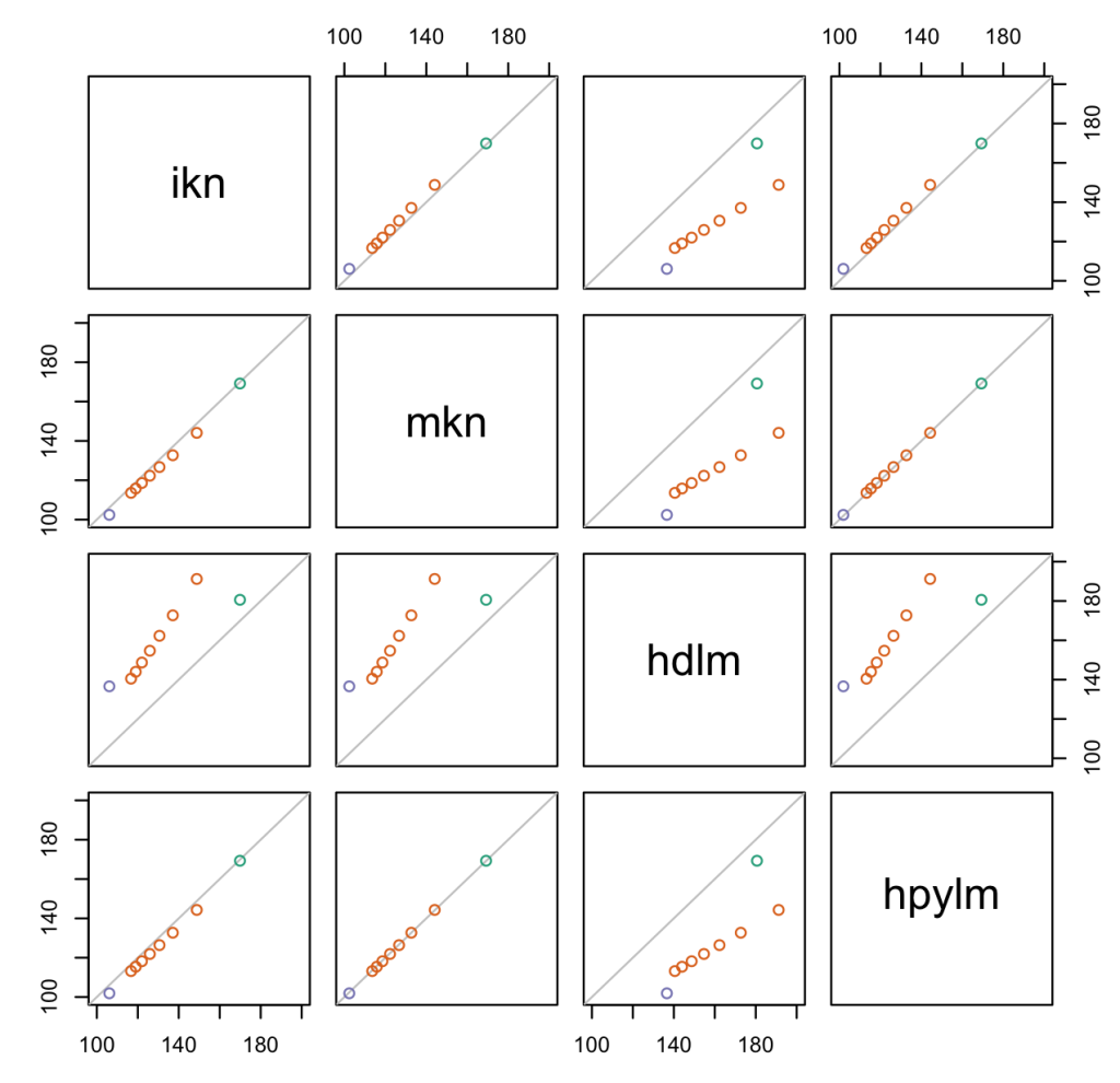
I think the following are results are from Yee Whye Teh’s paper on hierarchical Pitman-Yor language models, and in particular comparing them to Kneser-Ney and hierarchical Dirichlets. They’re specifically from these slides by Yee Whye Teh (page 25), which shows model perplexities. Every dot is for one experimental condition, which has four different results from each of the models. So a pair of models can be compared in one scatterplot.

teh_pyp_lm_comparison

where

  • ikn = interpolated kneser-ney
  • mkn = modified kneser-ney
  • hdlm = hierarchical dirichlet
  • hpylm = hierarchical pitman-yor

My reading: the KN’s and HPYLM are incredibly similar (as Teh argues should be the case on theoretical grounds). MKN and HPYLM edge out IKN. HDLM is markedly worse (this is perplexity, so lower is better). While HDLM is a lot worse, it does best, relatively speaking, on shorter contexts — that’s the green dot, the only bigram model that was tested, where there’s only one previous word of context. The other models have longer contexts, so I guess the hierarchical summing of pseudocounts screws up the Dirichlet more than the PYP, maybe.

The scatterplot matrix is from this table (colored by N-1, meaning the n-gram size):

Screen Shot 2014-02-17 at 8.21.39 PM

1 Comment

tanh is a rescaled logistic sigmoid function

This confused me for a while when I first learned it, so in case it helps anyone else:

The logistic sigmoid function, a.k.a. the inverse logit function, is

\[ g(x) = \frac{ e^x }{1 + e^x} \]

Its outputs range from 0 to 1, and are often interpreted as probabilities (in, say, logistic regression).

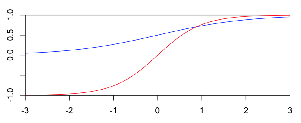
The tanh function, a.k.a. hyperbolic tangent function, is a rescaling of the logistic sigmoid, such that its outputs range from -1 to 1. (There’s horizontal stretching as well.)

\[ tanh(x) = 2 g(2x) - 1 \]

It’s easy to show the above leads to the standard definition \( tanh(x) = \frac{e^x – e^{-x}}{e^x + e^{-x}} \). The (-1,+1) output range tends to be more convenient for neural networks, so tanh functions show up there a lot.

The two functions are plotted below. Blue is the logistic function, and red is tanh.

Screen Shot 2013-10-31 at 4.32.04 PM

Leave a comment

Response on our movie personas paper

Update (2013-09-17): See David Bamman‘s great guest post on Language Log on our latent personas paper, and the big picture of interdisciplinary collaboration.


I’ve been informed that an interesting critique of my, David Bamman’s and Noah Smith’s ACL paper on movie personas has appeared on the Language Log, a guest post by Hannah Alpert-Abrams and Dan Garrette. I posted the following as a comment on LL.


Thanks everyone for the interesting comments. Scholarship is an ongoing conversation, and we hope our work might contribute to it. Responding to the concerns about our paper,

We did not try to make a contribution to contemporary literary theory. Rather, we focus on developing a computational linguistic research method of analyzing characters in stories. We hope there is a place for both the development of new research methods, as well as actual new substantive findings. If you think about the tremendous possibilities for computer science and humanities collaboration, there is far too much to do and we have to tackle pieces of the puzzle to move forward. Clearly, our work falls more into the first category — it was published at a computational linguistics conference, and we did a lot of work focusing on linguistic, statistical, and computational issues like:

  • how to derive useful semantic relations from current syntactic parsing and coreference technologies,
  • how to design an appropriate probabilistic model on top of this,
  • how to design a Bayesian inference algorithm for the model,

and of course, all the amazing work that David did in assembling a large and novel dataset — which we have released freely for anyone else to conduct research on, as noted in the paper. All the comments above show there are a wealth of interesting questions to further investigate. Please do!

We find that, in these multidisciplinary projects, it’s most useful to publish part of the work early and get scholarly feedback, instead of waiting for years before trying to write a “perfect” paper. Our colleagues Noah Smith, Tae Yano, and John Wilkerson did this in their research on Congressional voting; Brendan did this with Noah and Brandon Stewart on international relations events analysis; there’s great forthcoming work from Yanchuan Sim, Noah, Brice Acree and Justin Gross on analyzing political candidates’ ideologies; and at the Digital Humanities conference earlier this year, David presented his joint work with the Assyriologist Adam Anderson on analyzing social networks induced from Old Assyrian cuneiform texts. (And David’s co-teaching a cool digital humanities seminar with Christopher Warren in the English department this semester — I’m sure there will be great cross-fertilization of ideas coming out of there!)

For example, we’ve had useful feedback here already — besides comments from the computational linguistics community through the ACL paper, just in the discussion on LL there have been many interesting theories and references presented. We’ve also been in conversation with other humanists — as we stated in our acknowledgments (noted by one commenter) — though apparently not the same humanists that Alpert-Abrams and Garrett would rather we had talked to. This is why it’s better to publish early and participate in the scholarly conversation.

For what it’s worth, some of these high-level debates on whether it’s appropriate to focus on progress in quantitative methods, versus directly on substantive findings, have been playing out for decades in the social sciences. (I’m thinking specifically about economics and political science, both of which are far more quantitative today than they were just 50 years ago.) And as several commenters have noted, and as we tried to in our references, there’s certainly been plenty of computational work in literary/cultural analysis before. But I do think the quantitative approach still tends to be seen as novel in the humanities, and as the original response notes, there have been some problematic proclamations in this area recently. I just hope there’s room to try to advance things without being everyone’s punching bag for whether or not they liked the latest Steven Pinker essay.

6 Comments

Probabilistic interpretation of the B3 coreference resolution metric

Here is an intuitive justification for the B3 evaluation metric often used in coreference resolution, based on whether mention pairs are coreferent. If a mention from the document is chosen at random,

  • B3-Recall is the (expected) proportion of its actual coreferents that the system thinks are coreferent with it.
  • B3-Precision is the (expected) proportion of its system-hypothesized coreferents that are actually coreferent with it.

Does this look correct to people? Details below: Continue reading

3 Comments

Some analysis of tweet shares and “predicting” election outcomes

Everyone recently seems to be talking about this newish paper by Digrazia, McKelvey, Bollen, and Rojas (pdf here) that examines the correlation of Congressional candidate name mentions on Twitter against whether the candidate won the race.  One of the coauthors also wrote a Washington Post Op-Ed about it.  I read the paper and I think it’s reasonable, but their op-ed overstates their results.  It claims:

“In the 2010 data, our Twitter data predicted the winner in 404 out of 435 competitive races”

But this analysis is nowhere in their paper.  Fabio Rojas has now posted errata/rebuttals about the op-ed and described this analysis they did here.  There are several major issues off the bat:

  1. They didn’t ever predict 404/435 races; they only analyzed 406 races they call “competitive,” getting 92.5% (in-sample) accuracy, then extrapolated to all races to get the 435 number.
  2. They’re reporting about in-sample predictions, which is really misleading to a non-scientific audience; more notes on this further below.
  3. These aren’t predictions from just Twitter data, but a linear model that includes incumbency status and a bunch of other variables.  (Noted by Jonathan Nagler, who guessed this even before Rojas posted the errata/rebuttal.)

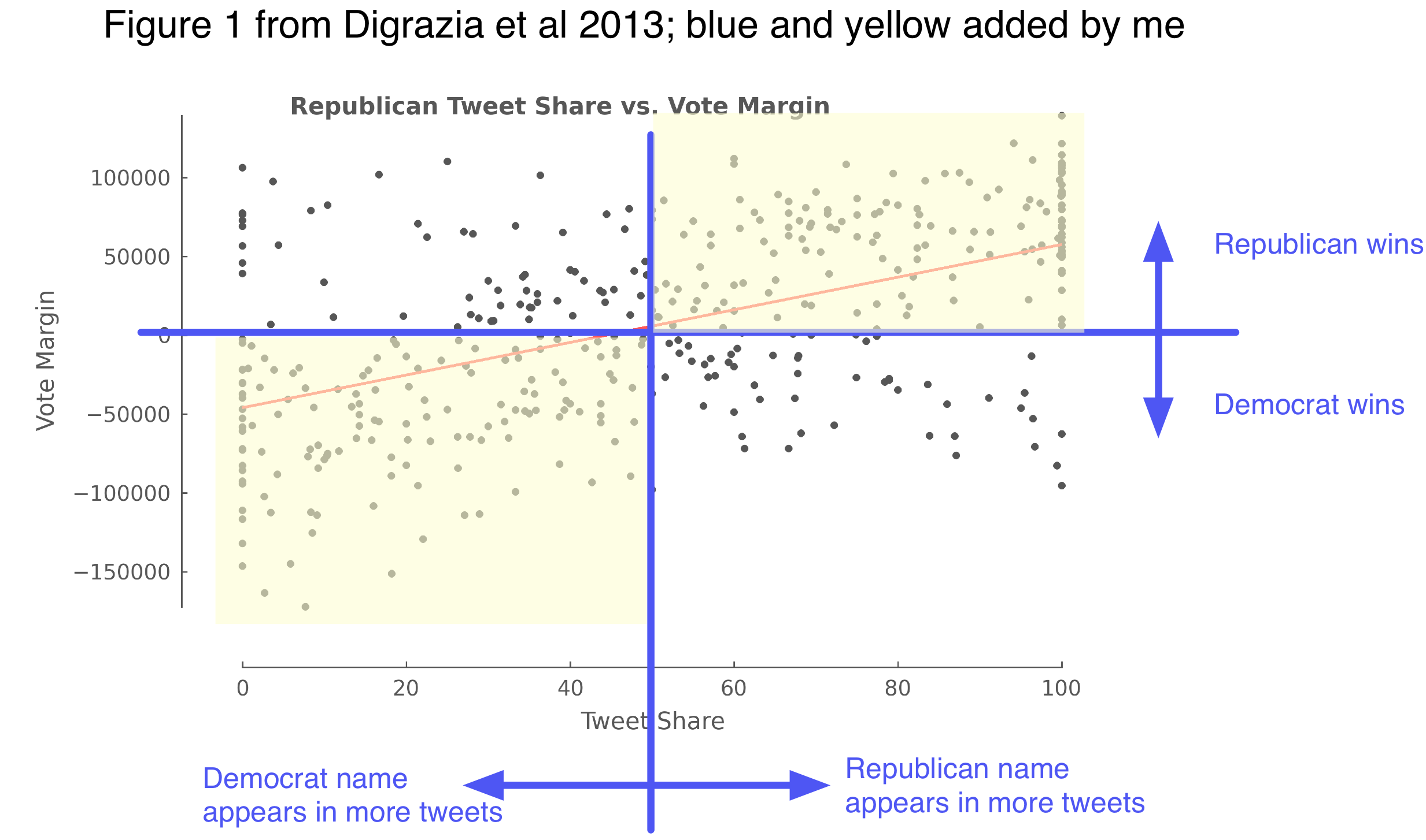
Given that the op-ed uses their results to proclaim that social media “will undermine the polling industry,” this sort of scrutiny is entirely fair.  Let’s take #3.  If you look at their Figure 1, as Nagler reproduces, it’s obvious that tweet share alone gives much less than that much accuracy. I’ve reproduced it again and added a few annotations:

Their original figure is nice and clear.  ”Tweet share” is: out of the name mentions of the two candidates in the race, the percentage that are of the Republican candidate. “Vote margin” is: how many more votes the Republican candidate got.  One dot per race.  Thus, if you say “predict the winner to be whoever got more tweet mentions,” then the number of correct predictions would be the number of dots in the shaded yellow areas, and the accuracy rate are them divided by the total number of dots.  This looks like much less than 93% accuracy.  [1]

It’s also been pointed out that incumbency alone predicts most House races; are tweets really adding anything here?  The main contribution of the paper is to test tweets alongside many controlling variables, including incumbency status.  The most convincing analysis the authors could have done would be to add an ablation test: use the model with the tweet share variable, and a model without it, and see how different the accuracies are.  This isn’t in the paper.  However, we can look at the regression coefficients to get an idea of relative variable importance, and the authors do a nice job reporting this.  I took their coefficient numbers from their “Table 1″ in the paper, and plotted them, below:

The effect sizes and their standard errors are on the right.  Being the incumbent is worth, on average, 49,000 votes, and it is much more important than all the other variables.  One additional percentage point of tweet share is worth 155 votes.  [2]  The predictive effect of tweet share is significant, but small.  In the paper they point out that a standard deviation worth of tweet share margin comes out to around 5000 votes — so roughly speaking, tweet shares are 10% as important as incumbency? [3]  In the op-ed Rojas calls this a “strong correlation”; another co-author Johan Bollen called it a “strong relation.” I guess it’s a matter of opinion whether you call Figure 1 a “strong” correlation.

On the other hand, tweet share is telling something that those greyed-out, non-significant demographic variables aren’t, so something interesting might be happening.  The paper also has some analysis of the outliers where the model fails.  Despite being clearly oversold, this is hardly the worst study of Twitter and elections; I learned something from reading it.

As always, I recommend Daniel Gayo-Avello’s 2012 review of papers on Twitter and election prediction:

… (Update: there’s also a newer review) and also see Metaxas and Mustafaraj (2012) for a broader and higher level overview of social media and elections. (Gayo-Avello also wrote a lengthy but sensible post on this paper.)

Next, point #2 — this “prediction” analysis shares a sadly often-repeated flaw, that the so-called “predictions” are evaluated on the training data (in ML-speak), i.e. they’re in-sample predictions (in socialscience-speak).  This is cheating: it’s awfully easy to predict what you’ve already seen!  XKCD has a great explanation of election model overfitting.  As we should know by now, the right thing to do is report accuracy on an out-of-sample, held-out test set; and the best test is to make forecasts about the future and wait to see if they turn out true.

It’s scientifically irresponsible to take the in-sample predictions and say “we predicted N number of races correctly” in the popular press.  It sounds like you mean predicting on new data.  Subsequent press articles that Rojas links to use verbs like “foretell” and “predict elections” — it’s pretty clear what people actually care about, and how they’re going to interpret a researcher using the term “prediction.”  In-sample predictions are a pretty technical concept and I think it’s misleading to call them “predictions.” [4]

Finally, somewhere in this whole kerfluffle hopefully there’s a lesson about cool social science and press coverage.  I feel a little bad for the coauthors given how many hostile messages I’ve seen about their paper on Twitter and various blogs; presumably this motivates what Rojas says at the end of their errata/rebuttal:

The original paper is a non-peer reviewed draft. It is in the process of being corrected, updated, and revised for publication. Many of these criticisms have already been incorporated into the current draft of the paper, which will be published within the next few months.

That sounds great and I look forward to seeing the final and improved version of the paper.  But, I feel like in the area of Twitter research, you have to be really cautious about your claims; they will get overblown by readers and the media otherwise.  Here, the actual paper is reasonable if limited; the problem is they wrote an op-ed in a major newspaper with incredibly expansive and misleading claims about this preliminary research!  This is going to bring out some justifiable criticism from the scientific community, I’m afraid.

[1] Also weird: many of the races have a 100% tweet share to one candidate.  Are the counts super low, like 3-vs-0? Does it need smoothing or priors? Are these from astroturfing or spamming efforts?  Do they create burstiness/overdispersion?  Name mention frequency is an interesting but quite odd sort of variable that needs more analysis in the future.

[2] These aren’t literal vote counts, but number of votes normalized by district size; I think it might be interpretable as, expected number of votes in an average-sized city.  Some blog posts have complained they don’t model vote share as a percentage, but I think their normalization preprocessing actually kind of handles that, albeit in a confusing/non-transparent way.

[3] I guess we could compare the variables’ standardized coefficients.  Incumbency as a 0-1 indicator, for 165 Republican incumbents out of 406 total in their dataset, is stdev ~ 0.5; so I guess that’s more like, a standardized unit of tweet share is worth 20% of standardized impact of incumbency?  I’m not really sure what’s the right way to compare here…  I still think difference in held-out accuracy on an ablation test is the best way to tell what’s going on with one variable, if you really care about it (which is the case here).

[4] I wish we had a different word for “in-sample predictions,” so we can stop calling them “predictions” to make everything clearer.  They’re still an important technical concept since they’re very important to the math and intuitions of how these models are defined.  I guess you could say “yhat” or “in-sample response variable point estimate”?  Um, need something better… Update: Duh, how about “fitted value” or “in-sample fits” or “model matched the outcome P% of the time”… (h/t Cosma)

[5] Numbers and graphics stuff I did are here.

1 Comment

Confusion matrix diagrams

I wrote a little note and diagrams on confusion matrix metrics: Precision, Recall, F, Sensitivity, Specificity, ROC, AUC, PR Curves, etc.

brenocon.com/confusion_matrix_diagrams.pdf

also, graffle source.

Leave a comment

Movie summary corpus and learning character personas

Here is one of our exciting just-finished ACL papers.  David and I designed an algorithm that learns different types of character personas — “Protagonist”, “Love Interest”, etc — that are used in movies.

To do this we collected a brand new dataset: 42,306 plot summaries of movies from Wikipedia, along with metadata like box office revenue and genre.  We ran these through parsing and coreference analysis to also create a dataset of movie characters, linked with Freebase records of the actors who portray them.  Did you see that NYT article on quantitative analysis of film scripts?  This dataset could answer all sorts of things they assert in that article — for example, do movies with bowling scenes really make less money?  We have released the data here.

Our focus, though, is on narrative analysis.  We investigate character personas: familiar character types that are repeated over and over in stories, like “Hero” or “Villian”; maybe grand mythical archetypes like “Trickster” or “Wise Old Man”; or much more specific ones, like “Sassy Best Friend” or “Obstructionist Bureaucrat” or “Guy in Red Shirt Who Always Gets Killed”.  They are defined in part by what they do and who they are — which we can glean from their actions and descriptions in plot summaries.

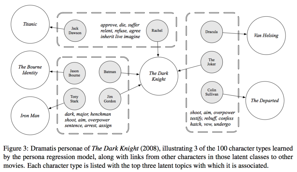
Our model clusters movie characters, learning posteriors like this:

Screen Shot 2013-05-07 at 10.11.23 PM


Each box is one automatically learned persona cluster, along with actions and attribute words that pertain to it.  For example, characters like Dracula and The Joker are always “hatching” things (hatching plans, presumably).

One of our models takes the metadata features, like movie genre and gender and age of an actor, and associates them with different personas.  For example, we learn the types of characters in romantic comedies versus action movies.  Here are a few examples of my favorite learned personas:

Screen Shot 2013-05-07 at 11.02.19 PM

One of the best things I learned about during this project was the website TVTropes (which we use to compare our model against).

We’ll be at ACL this summer to present the paper.  We’ve posted it online too:

2 Comments